Interface Tour
StitchKit is made up of two main screens: the Dashboard shell for the welcome page and navigation, and the Editor shell where you do your designing. This section introduces every region you see on screen. Interface labels are given in their original English; the note in parentheses is only there to explain the meaning.
The app shell and left menu
On the Dashboard screens there's a vertical navigation menu (sidebar) on the left, with the StitchKit logo and name at the top. When you click an item in the menu, the corresponding page opens and the active item is highlighted.
- "Dashboard" — the main welcome screen; summary cards and quick actions live here.
- "Library" — a list of your saved designs and patterns.
- "Fonts" — the page where you browse embroidery fonts.
- "Editor" — the environment for creating and editing designs.
- "Production" — batch/shop production tools. If your plan isn't sufficient, a lock icon appears next to the item, indicating that the tool requires a higher package.
- "Subscription" — plan and package management.
- "Credits" — your AI credit balance and adding credits.
- "Account" — your account information.
- "Settings" — app settings.
Tablet — On narrow screens the left menu collapses. Tap the menu (hamburger) button in the top bar to open and close the menu; when you select an item, the menu closes automatically.
Dashboard cards
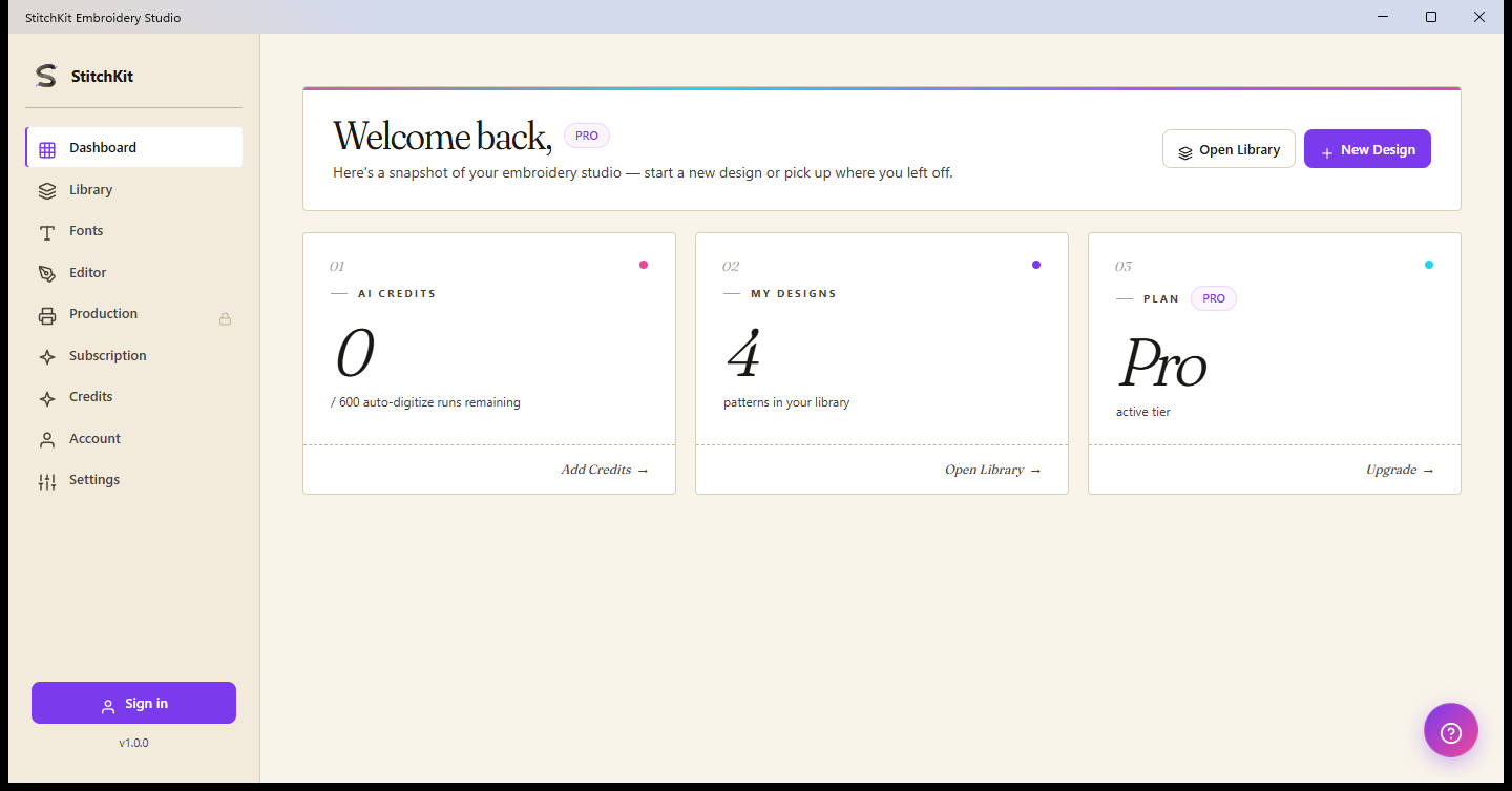
Dashboard: welcome heading, plan badge, and three summary cards.
At the top of the Dashboard there's a welcome heading with your name and a badge showing your current plan. The quick actions in the top right are the "Open Library" and "New Design" buttons; "New Design" takes you into the editor with a blank canvas.
Below the heading there are three summary cards:
- "AI Credits" — shows your remaining credit count and the cap (e.g. remaining / total). The link on the card takes you to the "Credits" page, where you can add credits.
- "My Designs" — shows the number of designs in your library. The link on the card opens the library.
- "Plan" — shows your currently active subscription tier. The link on the card takes you to the "Subscription" page, where you can upgrade your plan.
Tablet — The cards stack vertically to fit the screen width; their content and functions are the same.
The credit badge in the top bar
In the top bar of the Dashboard shell, on the right, there's a credit badge (a lightning icon and a number). This number is your current AI credit balance on your account. When you hover over the badge, the credits from your plan, along with any extra credits you've bought and your renewal date, are summarized in a tooltip. The badge only appears when you're signed in.
Tip — If the badge shows zero or is running low, you can add credits from the "Credits" page.
The help (?) bubble
On the Dashboard screens, a round help button (a ? / question-mark icon) floats in the bottom right. This button opens and closes the help and support chat. When you have a question, you can get in touch with support from here.
Note — The (?) button in the editor is different: as described below, it opens the keyboard shortcuts window.
The Editor top bar
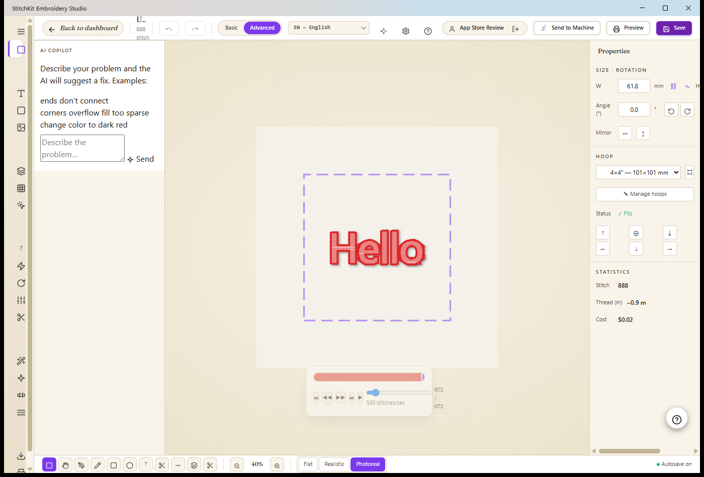
Editor: the top bar, the left tool rail, the canvas in the middle, and the properties panel on the right.
The bar at the very top of the editor gathers the overall actions for your design. From left to right:
- "Back to dashboard" — the back-arrow button; it exits the editor and returns to the dashboard. If there are unsaved changes, you're asked to confirm before leaving.
- File name and a short info line — the name of the currently open design appears here ("Untitled" if you haven't saved it).
- Undo / redo — undoes your last change or reapplies it; when there's nothing to do, the buttons are disabled.
- Basic / Advanced mode — a two-state selector. "Basic" simplifies the interface; "Advanced" unlocks the advanced tools and options. You can switch between them as you need.
- Language selector — you pick the interface language from a drop-down list; the choice is applied instantly.
- Photorealistic preview button (star icon) — a toggle button that turns the realistic look of the stitches on the canvas on and off.
- "Send to Machine" — for sending the design to an embroidery machine. This feature depends on your plan; if you don't have access, the button appears disabled and, when you hover over it, explains why it's locked.
- "Preview" — opens the print/preview page.
- "Save" — saves the design.
At the far right of the top bar there's also a settings (gear) button, a (?) button that shows the keyboard shortcuts, and — if you're signed in — your username with a sign-out button.
Tip — Instead of the buttons in the top bar, you can also use the keyboard shortcuts for undo/redo; you can see all the shortcuts in the window that opens from the (?) button.
The Editor left tool rail
On the left of the editor there's a vertical tool rail. Use the menu button at the top to expand the rail (which shows the labels) or collapse it; just below it there's an "Editor" item to return to the editor. The tools are organized into collapsible groups by topic:
- The Start group — creating new content: "Lettering", "Monogram", and "Import" (the image/SVG import wizard).
- The Edit group — editing an existing design: "Layers", "Layout", and "Selection".
- The Quality group — stitch-quality tools: "Troubleshoot", "Density", "Applique", and the like. Some items require a higher package and carry a PRO badge next to them.
- The Effect group — visual effects and color gradients: "Effects", 3D effects, "Multi-Color Fill", and "Guided Fill".
- The Output group — "Export" and "Print".
Tip — Click a group's heading to open or close the group and keep your workspace tidier. The PRO badge on a group item indicates that the feature requires a higher plan.
The right Properties panel
With a design open, the "Properties" panel appears to the right of the canvas. From here you set the dimensions and layout of the selected design. The panel is made up of these groups:
- Size and rotation — you enter the W (width) and H (height) values in millimeters. The chain button locks the aspect ratio; you rotate the design with the angle field and the ±90° quick-rotate buttons, and flip it horizontally/vertically with the mirror buttons.
- "Hoop" — you select a hoop from a drop-down list. When you do, whether the design fits in the hoop ("Fits" / "Out of bounds") is shown as a status; with the alignment buttons you can position the design within the hoop, and show or hide the hoop frame.
- Statistics — the total stitch count, approximate thread length (in meters), and estimated cost are summarized here. As you change the design, these values update.
Note — The right panel only appears when a design is open. On a blank canvas, suggestion cards appear in the middle to help you get started quickly.
The Editor bottom bar
The bar at the bottom of the editor holds the quick controls you use while working on the canvas:
- Tools — the icons on the left include drawing tools such as select, pan, Bezier/pen digitize, rectangle, and ellipse. When you select a drawing tool, style (fill) options also appear in the bar.
- Zoom — you zoom the canvas out and in with the minus/plus buttons; the percentage between them shows the current zoom level.
- Preview mode — three buttons where you choose how stitches are shown: "Flat" is a plain look, "Realistic" is a more textured look, and "Photoreal" is a perspective, photorealistic look.
Note — "Photoreal" mode requires a higher package; if you don't have access, the button is disabled and shows a PRO badge on it. If autosave is enabled, a small indicator showing the save status appears at the far right of the bottom bar.